Data Science Masterclass

Data Science Masterclass

Share this post

Data Science Masterclass
A Mini-Course on Machine Learning Visualizations - Part 2

A Mini-Course on Machine Learning Visualizations - Part 2

Cumulative Explained Variance Plot

Rukshan Pramoditha's avatar
Rukshan Pramoditha
Aug 18, 2023
∙ Paid
1

Share this post

Data Science Masterclass
A Mini-Course on Machine Learning Visualizations - Part 2
Share
An example of a cumulative explained variance plot (Image by author)

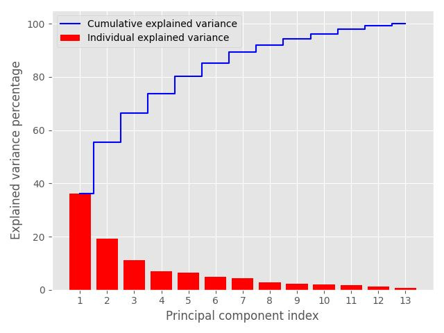
Usage category: Hyperparameter Tuning

The cumulative explained variance (CEV) plot is an advanced tool to select the right (best) number of components in PCA and Truncated SVD. It helps to tune the n_components hyperparameter in the PCA() and TruncatedSVD() classes.

In a CEV plot, the x-a…

Keep reading with a 7-day free trial

Subscribe to Data Science Masterclass to keep reading this post and get 7 days of free access to the full post archives.

Already a paid subscriber? Sign in
© 2025 Rukshan Manorathna
Privacy ∙ Terms ∙ Collection notice
Start writingGet the app
Substack is the home for great culture

Share